
Year

2026

Client

Grace And Taylor Coffee Co.

Timeline

Grace And Taylor

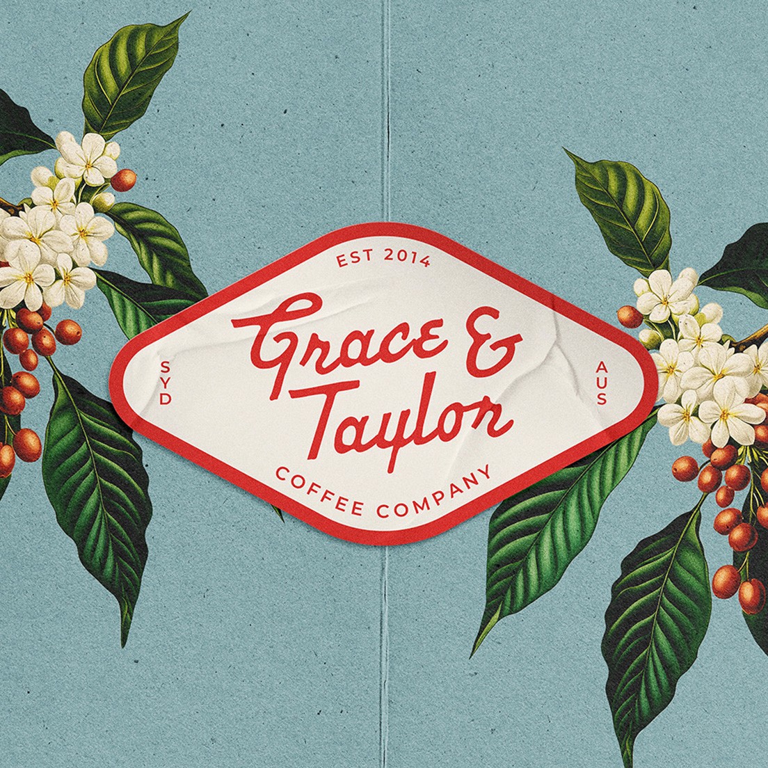
A vintage inspired coffee brand that rejects pretentiousness
Preview Image
Preview Image

"I had never seen such a beautiful design on a coffee bag before, truely unique, and uniquely ours"

"I had never seen such a beautiful design on a coffee bag before, truely unique, and uniquely ours"

"I had never seen such a beautiful design on a coffee bag before, truely unique, and uniquely ours"

Author

Keith Klien

Co-Owner

Details

year

2026

Client

Grace And Taylor Coffee Co.

Timeline

2 Months

Type

"after a number of failed rebrand attempts in the past it was time to try something new."

Grace and Taylor needed a brand that matched the quality of their product. One that stood out from the crowd and after a number of failed rebrand attempts in the past it was time to try something new. Matt and Keith approached me with a vision but needed help executing it, after a few calls we were able to get the brief locked in and start something wonderful together.

Project Image
Project Image

Challenge

The challenge for this project was taking Grace and Taylor's values and turning them into a visual system that felt recognisable, spoke to what they stood for, and avoided the pain points they'd run into before.

They wanted to steer clear of the pretentiousness that comes with specialty coffee. They wanted the brand to feel welcoming and community focused. Both clients loved a vintage inspired look, something they'd tried before but never quite landed. Other problems to solve were low visibility in the retail space and having to manually stamp and label every coffee bag, something they were keen to fix.

Project Image
Project Image

Solution

Bright, Textured and welcoming. The new brand leaned on everything that specialty coffee wasnt. More importantly it was cohesive and user friendly. Being a small team including the owners, it was developed with enough versitility that anyone could step in and use it.

The brand visually stands out from the predominantly monotone and minimal coffee space. Bright colours and vintage inspired illustrations give it a unique look, and paired with a modern sans serif typeface, it blends modern and vintage without looking cliche.

The new brand has a complete system to work from, a clear set of usage rules to keep it controlled, and the colour palette helps the product stand out on the retail shelf.

Project Image

Result

The final result was rolled out in time for MICE 26 in Melbourne where for those who knew Grace & Taylor before hand had only good things to say about it.

The new brand and business continues to go from strength to strength. Having regular contact with the client i'm always updated on the how well the brand continues to be received and that sales and online orders have increased significantly.

0%

0%

Increased Brand Recognition.

The new visual direction created a stronger first impression across retail and online touchpoints.

0%

0%

Increased Brand Recognition.

The new visual direction created a stronger first impression across retail and online touchpoints.

0%

0%

Increased Brand Recognition.

The new visual direction created a stronger first impression across retail and online touchpoints.

0%

0%

Increased Brand Recognition.

The new visual direction created a stronger first impression across retail and online touchpoints.

0%

0%

Increase To Online Sales

The new brand direction, along with SEO and better brand recognition translated into a significant increase in sales within the first year.

0%

0%

Increase To Online Sales

The new brand direction, along with SEO and better brand recognition translated into a significant increase in sales within the first year.

0%

0%

Increase To Online Sales

The new brand direction, along with SEO and better brand recognition translated into a significant increase in sales within the first year.

0%

0%

Increase To Online Sales

The new brand direction, along with SEO and better brand recognition translated into a significant increase in sales within the first year.

User
Isaac Bennett

Profession

Strategic Brand Designer

Location

NSW, Australia

Logo

Newcastle, NSW Australia

PH: 0432 642 153

EMAIL: Hello@superretrostudio.com

Contact

LETS BUILD A
BRAND THAT
LASTS

From first concept to final build, I create BRANDS THAT SHOW UP FROM DAY ONE

3

Slots

Available

Sept 2026

By submitting, you agree to our Terms and Privacy Policy.

© 2024 Super Retro Studio

All Right Reserved.

User
Isaac Bennett

Profession

Strategic Brand Designer

Location

NSW, Australia

Logo

Newcastle, NSW Australia

PH: 0432 642 153

EMAIL: Hello@superretrostudio.com

Contact

LETS BUILD A
BRAND THAT
LASTS

From first concept to final build, I create BRANDS THAT SHOW UP FROM DAY ONE

3

Slots

Available

Sept 2026

By submitting, you agree to our Terms and Privacy Policy.

© 2024 Super Retro Studio

All Right Reserved.

Contact

LETS BUILD A
BRAND THAT
LASTS

From first concept to final build, I create BRANDS THAT SHOW UP FROM DAY ONE

3

Slots

Available

Sept 2026

By submitting, you agree to our Terms and Privacy Policy.

© 2024 Super Retro Studio

All Right Reserved.

Contact

LETS BUILD A
BRAND THAT
LASTS

From first concept to final build, I create BRANDS THAT SHOW UP FROM DAY ONE

3

Slots

Available

Sept 2026

By submitting, you agree to our Terms and Privacy Policy.

© 2024 Super Retro Studio

All Right Reserved.